From hospitals to power grids and stock markets to experimental research, data is the lifeblood of modern society. But for all this information, it’s still a human society, and humans are an inherently visual species.
Data visualization translates information that is easy for computers to understand into a form that is easy for humans to understand. “When you see a stream of numbers, it’s hard to discern how things relate to each other,” says UC Santa Barbara Distinguished Professor George Legrady. “But the minute you turn it into an image, all of a sudden you see relationships.”
In his innovative course “Visualizing Information” — which he has offered for nearly two decades in the Media Arts and Technology graduate program — the professor and accomplished artist hopes to impart these skills and insights to his students.
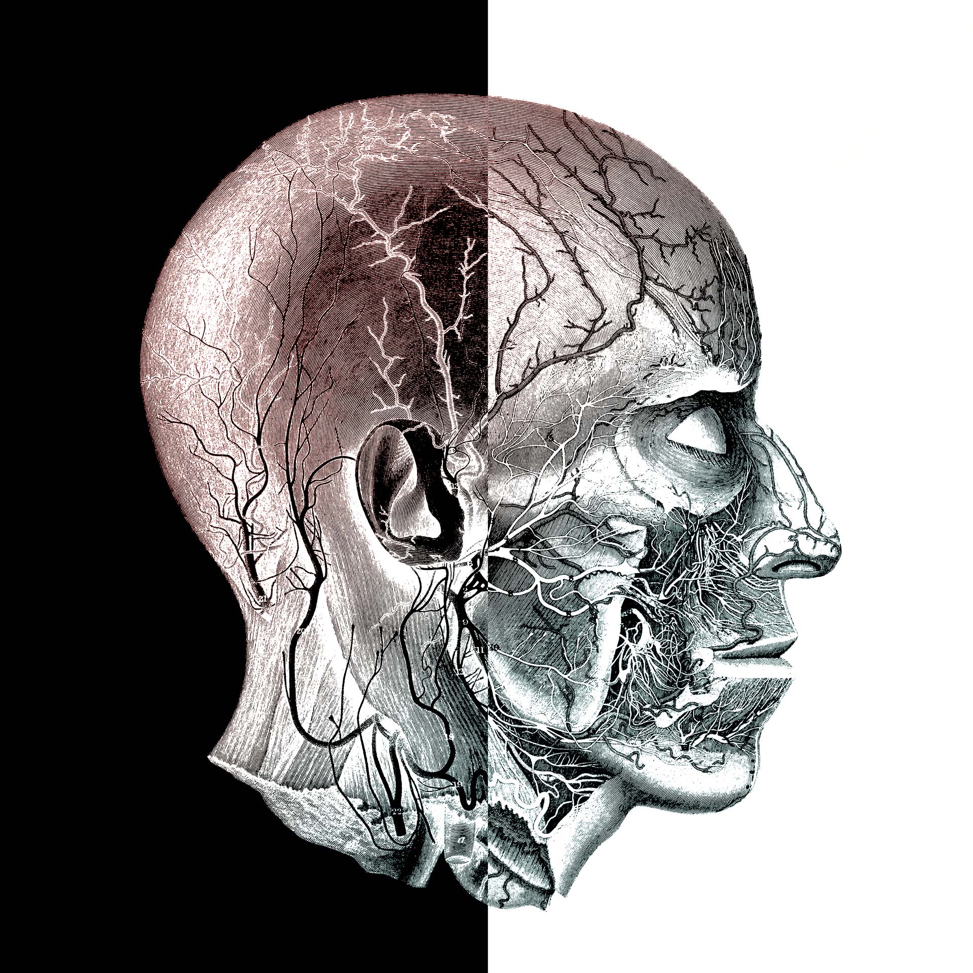
“It’s basically a crash course in visual language,” explains Legrady, whose own work in digital art stretches back to the 1980s. As an artist, he was always interested in new kinds of images. The rise of big data presented opportunities for novel explorations. Yet his approach and techniques are just as useful for scientists. Data visualization can help researchers gain insight into the systems they’re studying, including patterns, trends and promising avenues of inquiry.
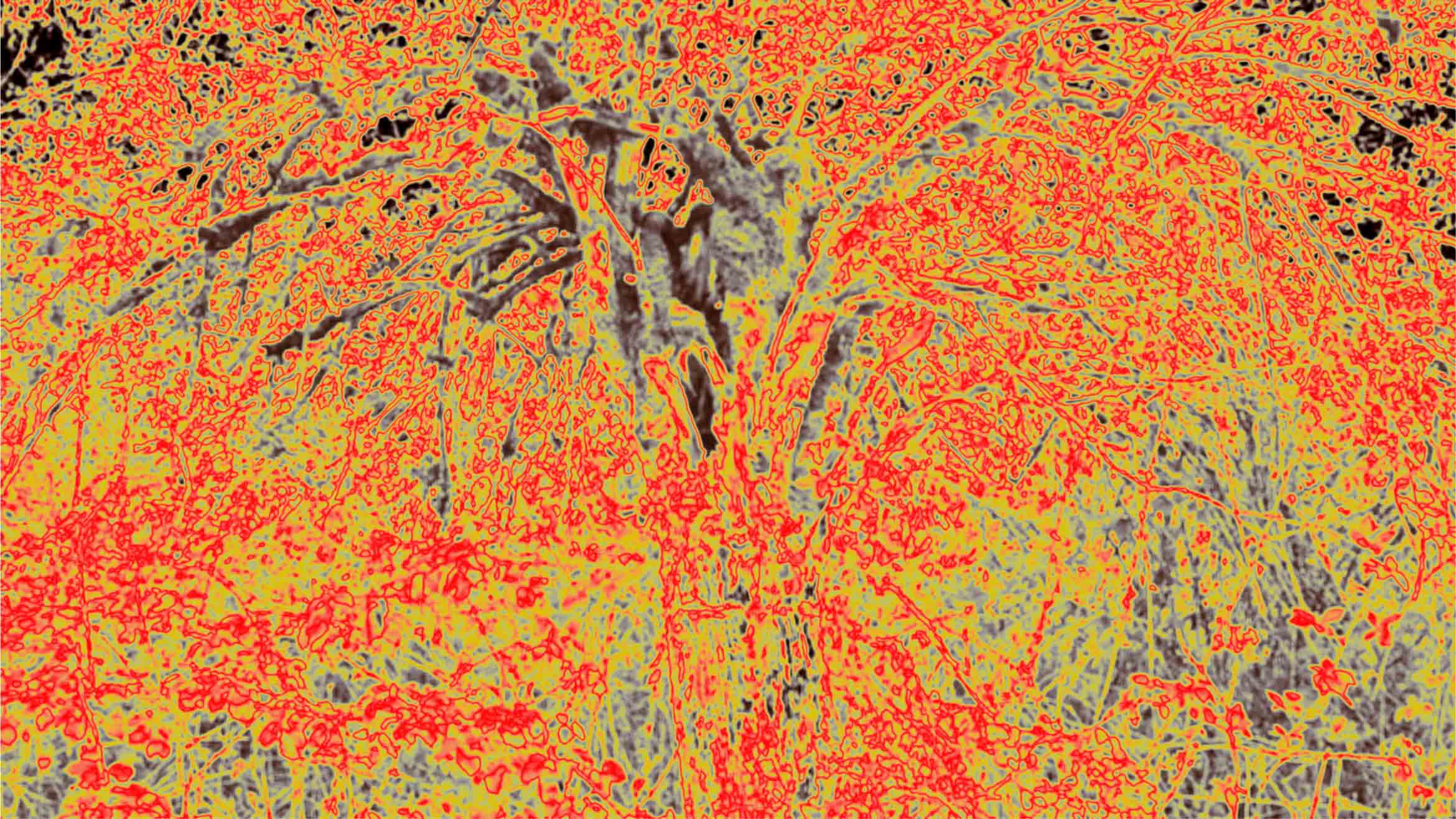
Shroud-Fontainebleau 1.3 | Dye Sublimation transfer on aluminum | George Legrady Studio, September 2018
Legrady’s course blends the analytical, technical and aesthetic components of modern data science into a holistic syllabus. The class covers data acquisition and cleaning as well as database languages like SQL. Students learn how form, color, space, timing and movement impact content, and how to create coherent, engaging visualizations that reveal patterns and relationships in the data.
The course grew from an art installation that Legrady created for the Seattle Public Library in September 2005 and that is still active today. His installation, “Making Visible the Invisible,” visualizes titles checked out from the library by the hour through four different animations.
“Everybody was talking about analyzing data,” Legrady says. “I thought, ‘Why don’t I do a course where we use the data collected by the artwork to teach students how to turn streams of numbers into a more meaningful expression?’” Four months later, the artwork was serving as the main case study for his newly developed course in visualizing information.
Students hone their skills and intuitions through a series of projects that involve Legrady’s data collected from “Making Visible the Invisible.” For their final assignment, each student collects their own data to create new visual expressions.
Legrady’s course fits perfectly into the Media Arts and Technology program, which aims to create a common platform between engineering, science and the arts. It’s an intrinsically interdisciplinary department, which facilitates and encourages courses like this.
“The classroom has people from mostly engineering and science,” Legrady says. “They learn from each other by sharing their methodologies. They teach each other.”